Design
Fintech App Landing Page
Design & Animations
•
2024


Overview
A fintech company needed a landing page refresh to add more vibrancy, improve engagement, and highlight key app features more effectively.

Design Approach
Enhanced Color Palette
The previous design used a minimalistic color scheme that lacked visual impact. To create a more engaging experience, I introduced vibrant purple backgrounds to define sections and improve contrast. Green highlights were used strategically to reinforce financial trust and guide users toward key actions.

Improved Visual Hierarchy
I refined the layout to make the most important information stand out. Key improvements include:
Larger, high-contrast headlines for instant clarity.
Refined iconography and illustrations for a more dynamic look.
Background elements and accents to create depth and separation between sections.
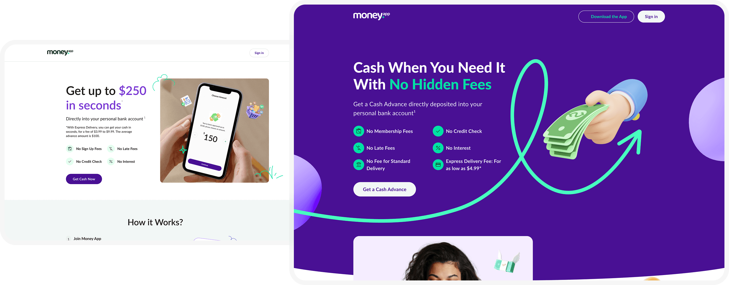
Stronger CTA Presence
To improve conversions, I made CTA buttons more eye-catching by:
Using bold purple buttons with clear, action-driven text.
Increasing button size and spacing for better accessibility.
Ensuring CTAs are placed prominently throughout the page.
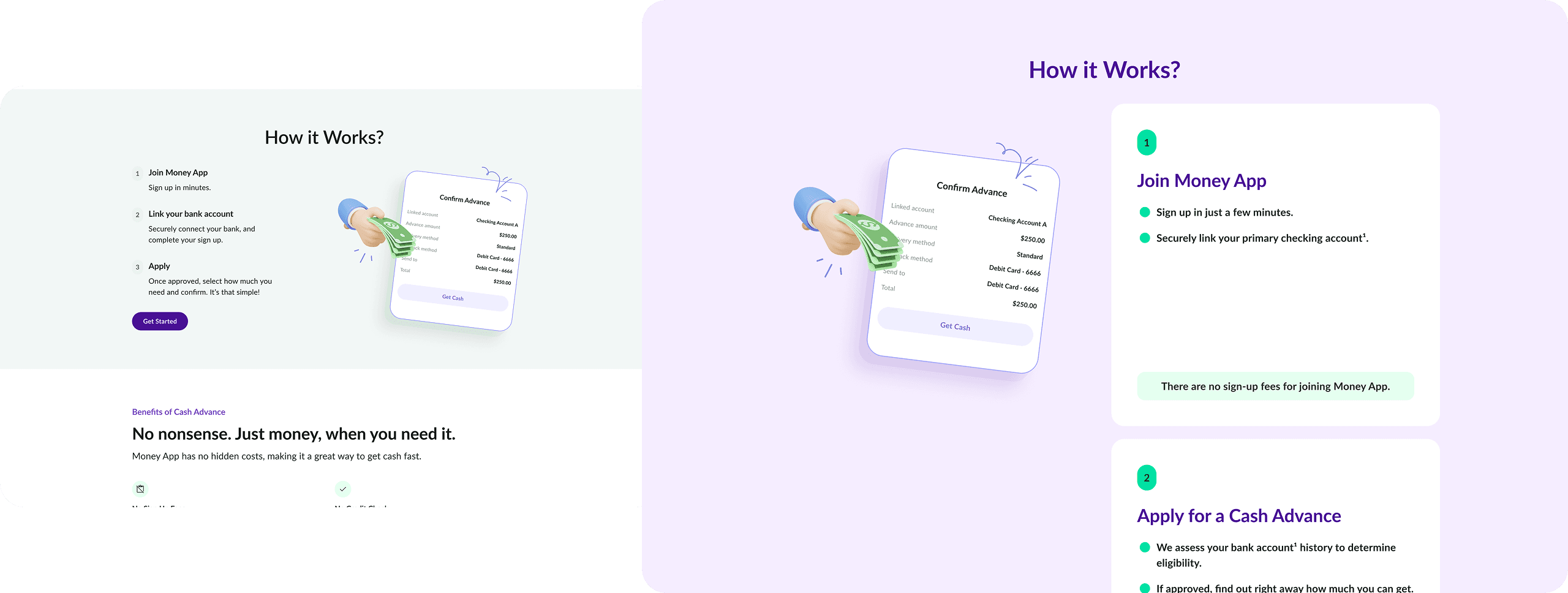
More Engaging User Experience
Revamped “How It Works” section with better visuals and step-by-step clarity.
Improved testimonials section with a more dynamic layout.
Stronger brand personality through enhanced typography and illustrations.
Conclusion
The redesign transformed the landing page into a more visually compelling and engaging experience. By leveraging vibrant colors, improved hierarchy, and stronger CTAs, the new design enhances usability and effectively communicates the fintech app’s benefits.
© Genrole Caspe 2026